Last Updated on: 24th December 2025, 12:15 am
Introduction
Let’s be honest. In the modern business world, we are drowning in information, but starved for insight. You have sales numbers in a spreadsheet, customer feedback in a email folder, website stats in one platform, and social media metrics in another. You might spend hours every week just pulling these numbers together into a presentation for your boss or your team, only to have someone ask a simple question that requires you to start all over again. Sound familiar?
What if there was a tool that could connect all these scattered pieces of information? A tool that could turn your static, boring spreadsheets into vibrant, interactive charts and maps? A tool that lets you ask questions of your data in plain English and get instant visual answers? That tool exists, and it’s called Power BI.
In this comprehensive guide, we’re gonna break down exactly what Power BI is, in simple, non-technical terms. We’ll explain its core parts—like reports and dashboards—how it actually works under the hood, and who really uses it across different industries. Forget complex jargon; think of this as your friendly map to a powerful tool that can save you time, reveal hidden opportunities, and transform the way you make decisions.
What Exactly IS Power BI? More Than Just Pretty Charts
At its heart, Power BI is a business analytics service developed by Microsoft. But that phrase can sound intimidating. A simpler way to think about it:
Power BI is a collection of software services, apps, and connectors that work together to turn your unrelated sources of data into coherent, visually immersive, and interactive insights.
Imagine you have puzzle pieces from ten different boxes scattered on the floor. You can see bits of the picture on each piece, but you can’t see the whole image. Power BI is like the table that lets you gather all those pieces, the process that helps you sort them, and the glued backing that turns them into a single, clear picture you can hang on the wall and show everyone.
It’s part of the broader Microsoft Power Platform, which also includes tools for building apps (Power Apps), automating workflows (Power Automate), and creating virtual agents (Power Virtual Agents). This family connection is important because it means Power BI often plays very nicely with other tools you might already use, like Excel, SharePoint, or Teams.
The Key Pieces of the Power BI Puzzle:
Power BI isn’t just one thing. It comes in a few main flavors, designed for different needs:
- Power BI Desktop: This is a free application you download and install on your Windows computer. It’s the primary design studio where most of the magic happens. Here, you connect to data, clean it up, build data models, and create the interactive reports and visuals. Think of it as the kitchen where you prepare the meal.
- Power BI Service (or Power BI Online): This is the cloud-based, online platform (often accessed via app.powerbi.com). This is where you publish, share, and collaborate on the reports you built in Desktop. You can also create dashboards here, set up automatic data refresh schedules, and share insights with colleagues across your organization. This is the dining room where you serve the meal.
- Power BI Mobile Apps: These are apps for iOS, Android, and Windows devices. They let you view your dashboards and reports on the go, get alerts, and interact with your data from your phone or tablet. This is like having a snack or checking the menu from anywhere.
There’s also a more powerful version called Power BI Premium which is a licensed capacity for larger organizations that need more data storage, more frequent refreshes, and the ability to share reports broadly without requiring every viewer to have a paid license.
Business Question #1: I already use Excel charts and pivot tables. Isn’t Power BI just a fancier version of that?
This is a super common question! Excel is a phenomenal, powerful tool for data analysis and calculation. You use Excel to work on data—to crunch numbers, run scenarios, and create static charts for a specific analysis. Power BI, on the other hand, is built for data visualization and business intelligence. Its strength is in presenting data interactively, connecting multiple data sources into a single view, and enabling self-service—letting business users explore the data on their own.
Think of it this way: Excel is your calculator and notepad. You use it to figure out the math. Power BI is your storyboard and presentation screen. You use it to tell the story of what that math means. You can actually connect Power BI directly to your Excel files, so they work together, not against each other.
Power BI Reports vs. Dashboards (What’s the Difference?)
People often use the terms “report” and “dashboard” interchangeably, but in Power BI, they have specific meanings. Understanding this difference is key to using the tool effectively.
Power BI Reports: The Interactive Canvas
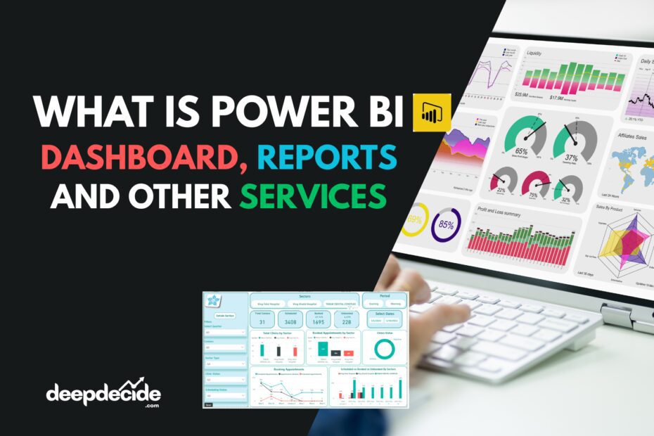
A Power BI Report is a multi-page, detailed view of your dataset. It’s where you, as a creator, place and arrange all the different visuals—like bar charts, line graphs, tables, maps, and gauges. Each visual is called a visualization (or “visual” for short).
- What’s in a Report?
- Visualizations: The individual charts and graphs (from a single pie chart to a complex waterfall chart).
- Pages: Just like a PowerPoint presentation, a report can have multiple pages (tabs at the bottom). You might have one page for Sales, another for Marketing, and another for Financial metrics.
- Filters: Reports have powerful, interactive filtering. You can click on a bar in a chart representing “Q1 Sales,” and every other visual on that page will automatically filter to show only data related to Q1. This is called cross-filtering and it’s one of the most powerful features for exploration.
- The Purpose of a Report: Reports are for exploration and detailed analysis. They are the deep-dive tool. When you need to answer a complex question like, “Why did sales drop in the Southwest region in July for Product Category A?” you go to a report. You can slice and dice the data, drill down from year to quarter to month, and uncover the root cause.
A simple analogy: A Power BI Report is like a detailed, interactive map of a city. You can zoom in to see individual streets (details), apply filters to only show restaurants or parks (specific data points), and click on a neighborhood to see its demographics (drill-through).
Power BI Dashboard Examples Here: Projects
Power BI Dashboards: The Single-Page Snapshot
A Power BI Dashboard is a single page, often called a canvas, that tells a story through visuals. But here’s the crucial part: A dashboard is built from pinning visualizations from one or more underlying reports. You can’t create a visual directly on a dashboard; you must create it in a report first and then pin it.
- What’s on a Dashboard?
- Tiles: Each visual pinned to a dashboard becomes a “tile.” You can move and resize these tiles to create a cohesive layout.
- A Unified View: The magic is that these tiles can come from completely different reports and even different datasets. This lets you create a high-level view that combines, for example, real-time sales data from your CRM with manufacturing metrics from your ERP system and website traffic from Google Analytics—all on one screen.
- Limited Interactivity: Dashboards are less about deep exploration and more about monitoring. You can click on a dashboard tile, which will typically open the underlying report for more detail. Some basic filtering is available, but not the deep cross-filtering of reports.
- The Purpose of a Dashboard: Dashboards are for monitoring and high-level overview. They are the “at-a-glance” tool. A CEO or department head might have a dashboard open on a wall-mounted screen or their phone home screen to track key performance indicators (KPIs) like Total Revenue, Customer Satisfaction Score, or Monthly Active Users in real-time.
Continuing the analogy: A Power BI Dashboard is like the instrument panel in your car. It doesn’t show you the detailed engineering schematics of the engine (that’s the report). It gives you the crucial, high-level info you need to drive: speed, fuel level, engine temperature, and warning lights. It’s a single-screen snapshot of health and performance.
Business Question #2: So, should I be building reports or dashboards first?
Start with the Report. Always. The report is where you do the foundational work of connecting to data, cleaning it, and building the meaningful charts. The dashboard is a curated output of that work. Focus on creating a really solid, insightful report that answers a specific business need (like “Sales Performance Analysis”). Once you have that, you can select the 4-5 most important charts from it and pin them to a dashboard for executives to monitor. You build the engine (report) before you build the dashboard (instrument panel).
How Does Power BI Actually Work?
The process of going from raw data to a beautiful, interactive report is often called the “Power BI workflow.” It typically follows three main stages, often visualized as a pipeline: Get Data, Transform & Model, Visualize & Share.
Let’s walk through each stage with a simple example: a small retail chain wanting to understand sales.
Stage 1: Get Data (Connect to Everything)
This is the first step in Power BI Desktop. You use the “Get Data” button to connect to your data sources. Power BI can connect to a staggering array of sources:
- Files: Excel, CSV, XML, JSON, PDF.
- Databases: SQL Server, Oracle, MySQL, PostgreSQL.
- Microsoft Services: Azure cloud services, SharePoint lists, Exchange.
- Online Services: Salesforce, Google Analytics, Facebook, Instagram, QuickBooks, Stripe, and hundreds more via connectors.
- Other: Blank queries, web URLs (to scrape data from a table on a webpage).
In our example: The business connects to three sources: 1) An Excel file with daily sales transactions, 2) Their SQL database holding customer information, and 3) A Google Analytics account for website traffic.
Stage 2: Transform & Model (The “Data Cleaning Gym”)
Raw data is messy. This stage happens primarily in the Power Query Editor within Power BI Desktop. It’s a powerful, point-and-click tool for shaping your data. Here, you:
- Clean: Remove duplicates, fix spelling errors, change data types (making sure numbers are numbers and dates are dates).
- Transform: Pivot/unpivot columns, split columns, merge data from different sources (like linking the “CustomerID” from your sales Excel to the “CustomerID” in your SQL customer database).
- Model: This is where you build the structure of your data. You create relationships between different tables (like linking a “Products” table to a “Sales” table). You can also create calculated columns (e.g., a “Profit” column = [Revenue] – [Cost]) and, most powerfully, Measures using a formula language called DAX (Data Analysis Expressions).
DAX is super important. It looks a bit like Excel formulas. A simple DAX measure would be:Total Sales = SUM(Sales[Revenue])
A more complex one might calculate year-over-year growth. This modeling stage is what makes your data intelligent and ready for complex questions.
In our example: You clean the sales data by standardizing product names. You merge the sales data with the customer database to add region and customer segment info. You create a relationship between the Sales table and a separate “Calendar” table (crucial for time-based analysis). You create DAX measures for “Total Revenue,” “Average Order Value,” and “Year-to-Date Sales.”
Stage 3: Visualize & Share (Bringing the Story to Life)
Now for the fun part. You switch to the Report View in Power BI Desktop.
- Visualize: You drag your fields (like “Product Category,” “Sales Date,” “Total Revenue”) onto the canvas and choose visuals from the Visualization pane. You make a bar chart of sales by category, a line chart of revenue over time, and a map showing sales by state. You format colors to match your company brand and add slicers (visual filters) for “Year” and “Region.”
- Share: Once your report is ready, you Publish it from Power BI Desktop to the Power BI Service (the online platform). Now, in the service, you can:
- Create a dashboard by pinning key visuals.
- Share the report or dashboard with colleagues or create an app to distribute content.
- Set up scheduled refresh so your report automatically pulls the latest data every night from your sources.
- Use the “Ask a question” feature (Q&A) to type “what were sales last month by region” and get an instant visual answer.
Business Question #3: This sounds technical. Do I need to be a data scientist or IT person to use it?
Absolutely not. This is the core promise of self-service BI. Power BI Desktop is designed for business analysts, managers, and power users—people who know their business data intimately but aren’t professional programmers. The Power Query Editor uses a graphical interface for most transformations. Building visuals is drag-and-drop. For basic reports, you might not need to write a single line of DAX.
However, for more complex, enterprise-level data modeling and advanced calculations, having someone with stronger data skills (a “power user” or BI developer) set up the foundational data model is invaluable. Then, business users can safely build reports on top of that trusted model. So, it scales from simple personal use to complex organizational deployment.
Who Really Uses Power BI? (It’s Not Who You Think)
The beauty of Power BI is its versatility. It’s used across virtually every industry and by people in many different roles.
1. By Industry:
- Retail & E-commerce: Track sales performance in real-time, analyze customer buying patterns, monitor inventory levels across warehouses, and measure campaign effectiveness.
- Finance & Banking: Create profit & loss dashboards, track key ratios, monitor loan portfolios, and visualize fraud detection patterns.
- Healthcare: Monitor patient outcomes, track hospital bed occupancy, analyze treatment costs, and visualize public health trends.
- Manufacturing: Track production line efficiency (OEE), monitor machine downtime, visualize supply chain logistics, and manage quality control metrics.
- Marketing & Sales: Track lead generation, pipeline health, campaign ROI, customer acquisition cost (CAC), and customer lifetime value (CLV).
- Human Resources: Analyze employee turnover, track diversity metrics, visualize recruitment pipeline, and monitor training completion rates.
2. By Role:
- Executives & Managers: They live on dashboards. They need the high-level KPI snapshot to make strategic decisions—profitability, company health, market trends.
- Business Analysts & Data Analysts: They are the primary report builders. They use Power BI Desktop daily to connect to data, model it, and create the rich, interactive reports that answer complex business questions.
- Sales Professionals: They might use a report to drill into their personal pipeline, see their performance against targets, or analyze their territory’s potential.
- Marketing Specialists: They use reports to track campaign metrics across channels, analyze website user behavior, and measure content engagement.
- Operations & Supply Chain Staff: They monitor dashboards for real-time operational metrics, like order fulfillment times, delivery truck locations, or inventory stock-outs.
- IT & Developers: They often manage the data gateway (a bridge for on-premises data to reach the cloud), ensure data security, and help build complex data models for the wider organization to use.
The common thread: Anyone who needs to make a decision based on data can benefit from Power BI. It turns data from a static, historical record into a dynamic, forward-looking asset.
Business Question #4: What are the biggest mistakes beginners make with Power BI?
A few common pitfalls:
- Starting without a clear question: Don’t just connect data and start dragging fields. Ask: “What business problem am I trying to solve?” Start with a sketch on paper.
- Ignoring data cleaning: Garbage in, garbage out. Spending time in Power Query to clean your data is the most important, albeit unglamorous, step.
- Overcomplicating visuals: 3D pie charts, too many colors, cluttered layouts. Keep it simple and clear. The goal is insight, not decoration.
- Building a report as a “data dump”: A report should tell a story. Guide the viewer through a logical flow. Use titles, text boxes, and thoughtful page organization.
- Forgetting about performance: Connecting to massive datasets or creating overly complex DAX measures can make reports slow to load. Model your data efficiently from the start.
A Deep Dive into Key Components: Power Query, DAX, and Visuals
To truly understand Power BI’s power, we need to look at its core engines.
Power Query: The Data Shaper
Power Query is the behind-the-scenes workhorse. It’s the tool you use in the “Transform & Model” stage. Think of it as a smart, automated data butler.
- Its Job: It takes your raw, messy data and applies a series of repeatable steps to clean and reshape it. These steps are recorded as a “Query”.
- The “M” Language: Underneath the point-and-click interface, Power Query uses a functional language called M. You don’t need to learn it to use Power Query, but knowing it exists is good. Every click you make (like removing a column or changing a data type) generates a line of M code. This means your cleaning process is reproducible. Next time you refresh your data, Power Query runs all these steps automatically.
- Why This Matters: Before Power Query, data cleaning was a manual, error-prone, and repetitive task. Now, you define the cleaning rules once, and they apply forever. This ensures consistency and saves massive amounts of time.
DAX (Data Analysis Expressions): The Brainpower
If Power Query is about shaping the data, DAX is about giving it meaning and intelligence. DAX is a formula language, used primarily to create Measures and Calculated Columns.
- Calculated Columns: These add a new column to your table by performing a row-by-row calculation (e.g.,
Profit = [Sales] - [Cost]). They use memory because they’re stored in the data model. - Measures: This is where DAX truly shines. A measure is a dynamic calculation that aggregates data based on the context of the report. The classic example is
Total Sales = SUM(Sales[Amount]). When you put this measure in a visual filtered to “2023,” it shows the sum for 2023. On a table with products, it shows the sum per product. It’s one formula that works everywhere. - Core DAX Concepts: To get started, understand these functions:
SUM,AVERAGE,COUNT(aggregation).CALCULATE(): The most powerful function. It changes the context of a calculation (e.g.,Sales Last Year = CALCULATE([Total Sales], SAMEPERIODLASTYEAR('Date'[Date]))).- Time Intelligence functions:
TOTALYTD,DATEADD,PREVIOUSMONTH(crucial for business reporting).
- The Learning Curve: DAX has a simple syntax but a deep, sometimes tricky, concept called filter context. This is why beginners can write simple measures quickly, but mastering advanced scenarios takes practice. The key is to start small.
Visualizations: The Storytellers
This is the most visible part of Power BI. Choosing the right visual is an art and a science.
- Basic Charts: Bar/Column charts (for comparison), Line charts (for trends over time), Pie/Doughnut charts (use sparingly for part-to-whole, with few categories).
- Specialized Visuals: Power BI has a vast AppSource marketplace for custom visuals. You can get things like:
- Decomposition Trees: To visually break down a metric (like total sales) by different dimensions (by region, then by product, then by salesperson) to find what’s driving a number.
- Key Influencers: An AI-powered visual that statistically identifies which factors most influence a metric (e.g., what influences customer churn?).
- ArcGIS Maps: For advanced geographic mapping.
- Gantt Charts, Funnel Charts, Waterfall Charts.
- Formatting is Key: Consistent color schemes (use your brand colors!), clear titles, thoughtful use of white space, and removing default “chart junk” (heavy gridlines, 3D effects) make reports look professional and trustworthy.
Business Question #5: Do I need to master DAX and M code to be good at Power BI?
Not at all. You can create incredibly valuable reports with just basic DAX (like sums and averages) and point-and-click Power Query. Mastery of these languages is for power users and developers who need to build complex, enterprise-level solutions. For 80% of business reporting needs, the graphical tools are more than sufficient. Learn them as you need them. Start by trying to create a simple measure like YTD Sales using the quick measure feature, which writes the DAX for you.
The Power BI Ecosystem: Service, Mobile, and Administration
Building a report in Desktop is only half the story. The real value is in sharing and collaborating.
The Power BI Service (app.powerbi.com): The Collaboration Hub
This is where your reports live and breathe in the organization.
- Workspaces: Think of these as shared folders or project spaces. You have “My Workspace” for personal stuff and App Workspaces for teams (like “Sales Analytics” or “Finance Reporting”). You publish reports from Desktop into a workspace.
- Apps: From a workspace, you can package a set of dashboards and reports into a polished, easy-to-navigate App. You then distribute this app to large groups of users (even your whole company). It provides a simplified, curated experience, hiding the underlying workspace complexity.
- Sharing & Security: You can share individual reports or dashboards, or give access via Apps. Security is granular through Row-Level Security (RLS), where you can define rules so that, for example, a salesperson only sees data for their own region, even in the same report.
- Data Refresh: You schedule refreshes here. For cloud data sources, it’s easy. For on-premises data (like a SQL server in your office), you need to install a Data Gateway on a machine in your network to act as a secure bridge.
Power BI Mobile: Insights in Your Pocket
The mobile apps are not an afterthought; they’re designed for consumption.
- Optimized Layouts: Reports and dashboards automatically adapt to phone screens. Creators can even design mobile-optimized report views separate from the desktop layout.
- Offline Viewing: You can download reports to view them without an internet connection—great for presentations on the go.
- Data Alerts: You can set alerts on dashboard tiles. If a KPI (like “Website Downtime”) goes above a certain threshold, you get a push notification immediately.
Administration and Governance
For larger companies, the Power BI Admin Portal is critical. Admins can:
- Monitor usage and performance.
- Set organizational policies (e.g., which data sources users can connect to, whether they can publish to the web).
- Manage licenses and capacities (like Premium).
- Audit user activities for security and compliance.
This ecosystem turns Power BI from a personal desktop tool into a scalable platform for the entire organization.
Business Question #6: Is my data safe in the Power BI cloud? What about privacy?
Microsoft invests heavily in security. Data in the Power BI Service is encrypted both in transit and at rest. Compliance certifications (like ISO, SOC, GDPR) are in place. The key responsibility for you, as a user/administrator, is to configure security correctly. This means using workspaces and Apps appropriately, setting up Row-Level Security for sensitive data, and not sharing reports publicly unless absolutely necessary. For highly regulated data, there are even options for keeping all data within your own country’s data centers. Always consult with your IT security team when deploying BI tools with sensitive information.
A Practical, Step-by-Step Learning Path
Feeling overwhelmed? Don’t be. Here’s a practical, incremental path to learning Power BI.
Week 1-2: The Foundation
- Download Power BI Desktop. It’s free. Just get it.
- Find a dataset. Start with an Excel or CSV file you know well—maybe last year’s sales or your department’s budget.
- Follow a “Your First Report” tutorial. Microsoft’s own guided learning path on their website is excellent. It will walk you through Get Data, making a simple visual, and publishing.
- Goal: Create one report page with a bar chart and a table. Publish it to the free Power BI Service and view it on your phone.
Month 1: Building Comfort
- Learn Basic Power Query. Do a tutorial on cleaning data: removing rows, splitting columns, changing types.
- Learn Basic DAX. Create 5 core measures:
Total Sales,Total Quantity,Average Price,Distinct Count of Customers, and a simple ratio likeProfit Margin. - Experiment with Visuals. Try 5 different chart types. Use a slicer.
- Goal: Build a small, clean report from a slightly messy dataset that tells a clear story with at least 3 different visual types and a slicer.
Month 2-3: Going Deeper
- Work with Multiple Tables. Import a Sales table and a separate Product table. Create a relationship between them.
- Learn
CALCULATE()and Time Intelligence. Create aSales Last Yearmeasure and aYear-over-Year Growth %measure. - Design a Dashboard. Pin visuals from your report to a new dashboard in the Service. Arrange them nicely.
- Goal: Create a multi-table data model with relationships and build a report with time intelligence analysis. Create a companion executive dashboard.
Ongoing: Mastery and Community
- Join the Community. Follow the #PowerBI hashtag on Twitter/X, join the r/PowerBI subreddit, read blogs (SQLBI, Guy in a Cube).
- Practice with Real Problems. The best learning is solving real business questions. Offer to build a small report for another team.
- Consider Certification. The PL-300: Microsoft Power BI Data Analyst certification is a great goal to structure your learning.
The most important step is to start. Open the tool, connect some data, and click around. You learn by doing.
Conclusion
Power BI is more than just software; it’s a paradigm shift in how businesses interact with information. It democratizes data, taking it out of the sole domain of IT and putting it directly into the hands of the people who need it most: the decision-makers, the strategists, and the front-line operators.
It bridges the gap between the complexity of data and the simplicity of insight. Whether you’re a manager needing a daily snapshot, an analyst hunting for the cause of a trend, or a CEO tracking the company’s North Star metrics, Power BI provides a scalable, powerful, and intuitive platform to light your way.
The journey from raw data to wisdom is no longer a technical marathon reserved for a few. With Power BI, it’s a path anyone can walk. It starts with a single question, a single data source, and the curiosity to click “Get Data.” The power, as the name suggests, is now in your hands—to visualize, to understand, and to decide with confidence.
The best part? You can start for free. Download Power BI Desktop, connect it to an Excel file you already have, and begin exploring. The first chart you make might be simple, but it’s the first step in transforming not just your data, but how you see your entire business.
FAQs: Power BI for Beginners
Q: How much does Power BI cost for a small business or individual?
A: For individuals creating reports, Power BI Desktop is completely free. To share and collaborate in the Power BI Service, you typically need licenses. The core license is Power BI Pro (around $10 per user per month), which allows you to publish, share, and collaborate. Power BI Premium is for larger-scale deployment and starts at about $5,000 per month for a dedicated cloud capacity, but it allows you to share content with viewers who don’t need a Pro license. There’s also a Power BI Premium Per User (PPU) license for advanced features at an individual level.
Q: Can I use Power BI on a Mac?
A: The official Power BI Desktop application is only available for Windows. However, you can use the Power BI Service (the web portal) fully on a Mac browser for viewing, editing, and light report creation. For full report development on a Mac, options include running Windows via Boot Camp, using a virtual machine, or using the web-based reporting features (still in preview and limited). Many Mac users do their development on a Windows virtual machine.
Q: What’s the difference between Power BI and Tableau?
A: Both are leading BI tools. Broadly, Tableau is often praised for its intuitive, drag-and-drop visual exploration and beautiful default visuals. Power BI is praised for its deep integration with the Microsoft ecosystem (Office 365, Azure, SQL Server), its lower cost, and the power of its data modeling engine (DAX). Power BI often has an edge for businesses already invested in Microsoft products, while Tableau has a strong following among data visualization specialists. The “best” tool depends heavily on your specific needs, existing tech stack, and user skills.
Q: How do I handle data that’s on my company’s local server (not in the cloud)?
A: You use the On-premises Data Gateway. It’s a small piece of software you install on a computer within your company network. This gateway acts as a secure bridge. In Power BI Service, you configure your dataset to refresh via this gateway, allowing the cloud service to securely reach back into your local SQL Server, file share, or other on-premises data source to get the latest data.
Q: I built a report. How do I get it to update automatically when my source data changes?
A: You set up a Refresh Schedule in the Power BI Service. For cloud sources (like Salesforce, Google Analytics), this is straightforward. For on-premises data (like an Excel file on a shared drive), you need the Data Gateway installed and configured. You can schedule refreshes as often as every 30 minutes (Pro license) or even more frequently (Premium). The process is automated; you set it once and it runs in the background.