Last Updated on: 16th February 2026, 11:04 am
In today’s data-driven world, almost every business collects data. From website clicks to sales numbers, customer behavior to operational metrics, everything is tracked. But here’s the real question:
Is simply showing data enough?
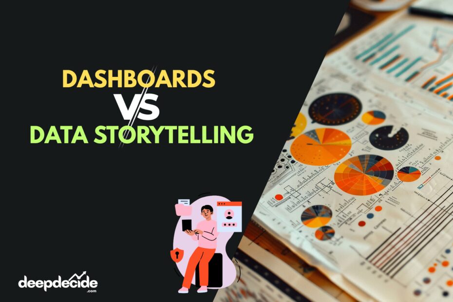
Many companies build dashboards. Others focus on data storytelling. Some think both are the same. But they are not. And understanding the difference between dashboards and data storytelling can completely change how your organization makes decisions.
What is a Dashboard?
A dashboard is a visual interface that displays key metrics and KPIs in one place. It is designed to monitor performance, track trends, and provide quick insights.
Think of a car dashboard. It shows speed, fuel level, temperature. You don’t get a long explanation. You just see the numbers.
In business, dashboards work the same way.
For example, in tools like Microsoft Power BI, Tableau, or Looker, dashboards show:
- Revenue trends
- Monthly sales
- Website traffic
- Conversion rates
- Customer churn
- Employee attendance
- Operational efficiency
Dashboards are mostly used for:
- Real-time monitoring
- Operational reporting
- Performance tracking
- Daily business reviews
Simple Definition
A dashboard is a visual summary of data used to monitor and track performance.
It answers:
- What is happening?
- How much?
- How fast?
- Compared to what?
But usually, it does not answer why.
What is Data Storytelling?
Data storytelling is the process of combining data, visuals, and narrative to communicate insights compellingly and understandably.
It’s not just about showing charts.
It’s about explaining:
- What happened
- Why it happened
- What it means
- What should be done next
Data storytelling combines:
- Data (numbers, metrics)
- Visuals (charts, graphs)
- Narrative (context and explanation)
When someone uses Microsoft PowerPoint or Google Slides to explain insights from Microsoft Excel or Power BI data, that becomes data storytelling.
Simple Definition
Data storytelling is the art of explaining insights using data, visuals, and clear narrative to drive decisions.
It answers:
- Why did it happen?
- What does it mean?
- What should we do next?
Dashboards vs Data Storytelling: Core Differences
Let’s compare them deeply.
1. Purpose
Dashboard: Monitoring
Data Storytelling: Decision making
Dashboards show status.
Storytelling drives action.
2. Audience
Dashboards are mostly for:
- Analysts
- Managers
- Operational teams
Data storytelling is for:
- Executives
- Stakeholders
- Non-technical audience
3. Depth of Insight
Dashboards show surface-level metrics.
Storytelling goes deeper into patterns, root causes, and implications.
4. Interactivity
Dashboards are interactive. You can filter, drill down, change views.
Storytelling is more guided. The presenter controls the narrative flow.
5. Emotional Engagement
Dashboards are factual.
Storytelling connects emotionally and strategically. It makes people care about the numbers.
Why Dashboards Alone Are Not Enough
Many organizations build advanced dashboards in tools like Microsoft Power BI and think their job is done.
But here is the problem.
Not everyone understands data.
A CEO doesn’t want to explore filters and slicers. They want:
- Clear insights
- Risks
- Opportunities
- Recommendations
If you show 20 charts without explanation, people feel confused. Sometimes they ignore the dashboard completely.
This is where data storytelling becomes powerful.
Why Data Storytelling Without Dashboards Also Fails
On the other side, if you only create presentations without structured dashboards, problems happen:
- No real-time updates
- No consistent KPI tracking
- No operational monitoring
- Manual reporting every time
Storytelling without a dashboard foundation becomes slow and unreliable.
So, which one is better?
The truth is:
You need both.
But you need to understand when to use each.
When to Use Dashboards
Dashboards are perfect for:
1. Real-Time Performance Monitoring
For example:
- Daily sales tracking
- Live website analytics
- Inventory monitoring
2. Operational Teams
Teams that need quick numbers:
- Sales managers
- HR departments
- Manufacturing units
3. KPI Tracking
If your goal is to measure performance against targets, dashboards are ideal.
4. Self-Service Analytics
Users who want to explore data themselves can use interactive dashboards.
When to Use Data Storytelling
Use storytelling when:
1. Presenting to Leadership
Executives need clarity, not complexity.
2. Strategic Decisions
Entering a new market
Reducing cost
Improving retention
These require explanation, not just charts.
3. Persuasion
If you want budget approval, policy change, or strategy shift, storytelling works better.
4. Complex Data
When data has multiple layers and relationships, narrative is required.
Real-World Example: Dashboard vs Storytelling
Imagine an e-commerce company.
Dashboard Shows:
- Sales dropped 12% in last quarter
- Website traffic increased 8%
- Cart abandonment increased 15%
That’s useful.
But it doesn’t explain.
Data Storytelling Explains:
- Traffic increased from low-converting social campaigns
- Checkout page load time increased by 3 seconds
- Mobile users faced payment issues
- Result: Higher abandonment
Then recommendation:
- Improve checkout performance
- Optimize mobile payment
- Focus on high-intent traffic
See the difference?
Dashboard shows problem.
Storytelling solves it.
Psychological Impact of Data Storytelling
Humans are wired for stories.
From childhood, we understand stories better than raw numbers.
When you say:
“Revenue dropped 8%.”
That’s information.
When you say:
“Because customer churn increased in premium segment due to price sensitivity after competitor discount campaign, revenue declined 8%.”
Now that’s insight.
It connects cause and effect.
Common Mistakes in Dashboards
- Too many charts in one page
- Poor color usage
- No clear KPI hierarchy
- No context or benchmark
- Overuse of pie charts
- Not defining metrics properly
Many dashboards look beautiful but don’t communicate clearly. And sometimes people think more visuals means more insight, which is not always true.
Common Mistakes in Data Storytelling
- Too much text
- Weak narrative flow
- No actionable recommendations
- Cherry picking data
- Ignoring counter insights
- Over dramatic conclusions
Storytelling must still be data driven. Not opinion driven.
The Evolution of Business Intelligence
Earlier, business intelligence focused on reporting.
Then came interactive dashboards with tools like Tableau.
Now, companies are moving toward:
- Augmented analytics
- AI powered insights
- Predictive storytelling
Even modern platforms integrate storytelling features inside dashboards.
But still, human interpretation is very important.
How to Combine Dashboards and Data Storytelling
The best strategy is hybrid.
Step 1: Build a strong dashboard foundation
Step 2: Identify key insights
Step 3: Create narrative presentations
Step 4: Use dashboard as backup during discussions
This approach works very well in executive meetings.
Dashboards vs Data Storytelling in Power BI
Since many professionals use Microsoft Power BI, let’s understand in that context.
In Power BI Dashboard:
- Cards show KPIs
- Line charts show trends
- Slicers allow filtering
- Drill-through allows exploration
In Data Storytelling Mode:
- You create presentation slides
- Highlight key visuals
- Add explanation text
- Guide audience step by step
Power BI even has features like bookmarks and narrative visuals to help storytelling.
But the mindset matters more than the tool.
The Strategic Value of Data Storytelling
Companies that adopt data storytelling:
- Make faster decisions
- Align teams better
- Improve stakeholder confidence
- Reduce misinterpretation
- Increase ROI from analytics
Without storytelling, dashboards often become decorative.
Short Example
Imagine a healthcare organization.
Dashboard shows:
- Increase in patient waiting time
- Drop in satisfaction score
Storytelling reveals:
- Staff shortage during night shifts
- System downtime in registration
- Increase in emergency cases
Action:
- Adjust shift scheduling
- Improve IT reliability
See the transformation from numbers to strategy.
Technical Depth: Data Storytelling Framework
A good storytelling structure:
- Context
- Problem
- Data Evidence
- Insight
- Recommendation
- Expected Impact
If any of these is missing, the story feels incomplete.
Future of Dashboards and Data Storytelling
With AI integration:
- Automatic insights
- Natural language summaries
- Predictive dashboards
But even with AI, communication skills matter.
Tools can generate charts.
Humans generate meaning.
Comparison Summary
Dashboards:
- Monitor
- Track
- Interactive
- Operational
Data Storytelling:
- Explain
- Persuade
- Strategic
- Action oriented
They are not competitors.
They are partners.
FAQs
1. What is the main difference between dashboards and data storytelling?
Dashboards display metrics for monitoring, while data storytelling explains insights and drives decisions using narrative and context.
2. Can a dashboard replace data storytelling?
No. Dashboards show what is happening but usually do not explain why it is happening or what action to take.
3. Is data storytelling only for executives?
Not only executives, but it is especially powerful for leadership and non-technical stakeholders.
4. Which is better for real-time analytics?
Dashboards are better for real-time performance monitoring.
5. Can Power BI be used for data storytelling?
Yes, Microsoft Power BI supports storytelling through bookmarks, tooltips, and narrative visuals.
6. Does data storytelling require technical skills?
It requires understanding of data plus communication skills. Both are important.
7. Why do dashboards sometimes fail?
Because they lack context, clear KPIs, or are overloaded with visuals.
8. What are the key elements of data storytelling?
Data, visuals, narrative, and actionable recommendation.
9. How can businesses combine dashboards and storytelling?
By using dashboards for monitoring and storytelling for strategic presentations.
10. Is data storytelling the future of business intelligence?
Yes, because decision-makers need meaning, not just metrics.
Conclusion
Dashboards vs data storytelling is not a competition.
It is a collaboration.
Dashboards provide the foundation.
Storytelling provides direction.
In modern business intelligence strategy, companies that combine both approaches win faster, decide better, and grow stronger.
If your organization is only building dashboards, you are only halfway there.
Start telling stories with your data.
That’s where real transformation begins.