Last Updated on: 2nd May 2024, 12:58 pm
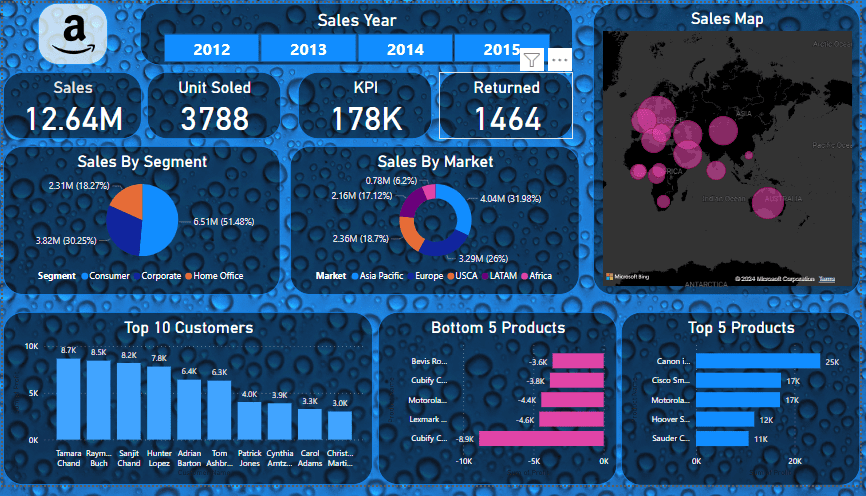
Amazon Sales Dashboard includes these visuals:
- Sales Year (2012 – 2015)
- Sales By Segment
- Sales By Market
- Top 10 Customers
- Bottom 5 Products
- Top 5 Products
- Sales Map
Reporting Visuals are Based On
- Sales Year (2012 – 2015):
- The dashboard shows data for the years 2012 to 2015, with 2015 highlighted as the selected year.
- Key Metrics:
- Total Sales: 12.64 million (presumably in currency units).
- Units Sold: 3788.
- Key Performance Indicator (KPI): 178K (possibly another metric related to performance).
- Returns: 1464 (indicating returned items).
- Sales By Segment:
- A pie chart illustrates the distribution of sales across different customer segments:
- Consumer: 51.48%
- Corporate: 20.25%
- Home Office: 28.27%
- Sales By Market:
- Another pie chart represents sales by geographical market:
- Asia Pacific: 52%
- Europe: 17.21%
- USCA (United States and Canada): 13.98%
- LATAM (Latin America): 9.69%
- Africa: 7.12%
- Top 10 Customers:
- A bar graph lists the top ten customers based on their purchase volumes.
- Customer names are partially visible, including “Tammy Ryan” and “Sushil Chand.”
- Bottom 5 Products:
- A horizontal bar graph in pink color displays five products that are likely underperforming or have been returned (indicated by negative values).
- Top 5 Products:
- Another horizontal bar graph shows the top five products based on either units sold or revenue generated.
- Sales Map:
- On the right side of the dashboard, a world map highlights regions where sales have occurred.
- Pink bubbles of varying sizes represent the intensity of sales in different regions.
Improvements Using Dashboard
Using the sales dashboard effectively can lead to improved decision-making and strategic planning. Here’s an analysis of how to leverage the information from the dashboard to enhance performance:
- Focus on High-Performing Segments:
- The Consumer segment accounts for over half of the sales. Strategies could include targeted marketing campaigns or loyalty programs to further increase sales in this segment.
- The Corporate and Home Office segments, while smaller, still represent significant portions of sales and may benefit from personalized outreach or volume discounts.
- Expand in High-Potential Markets:
- The Asia Pacific market is the largest, indicating a strong presence or demand. Investigate what drives success in this market and replicate these strategies in other regions.
- The relatively lower sales in LATAM and Africa suggest potential for growth. Consider market research to understand local preferences and barriers to entry.
- Analyze Top Customers:
- Review the purchasing patterns of the top 10 customers to understand why they are buying in high volumes. This could reveal insights into product preferences or service satisfaction.
- Strengthen relationships with these customers through personalized services or exclusive offers.
- Improve or Discontinue Bottom Products:
- The bottom 5 products may need a reassessment. Determine if they are underperforming due to quality issues, market fit, or competition.
- Consider improving these products or reallocating resources to more profitable items.
- Promote Top Products:
- The top 5 products are likely driving a significant portion of revenue. Focus on promoting these products, bundling them with other items, or exploring new markets for them.
- Utilize Sales Map for Geographical Insights:
- Use the sales map to identify regions with high sales volume and explore why these areas are performing well.
- Conversely, look at regions with smaller bubbles to understand the challenges and develop strategies to increase sales there.
- Monitor KPIs and Returns:
- Keep a close eye on the KPIs to gauge the health of the sales process. If returns are high, investigate the reasons and implement quality control or customer feedback mechanisms.
By analyzing the data presented in the dashboard, you can identify trends, strengths, weaknesses, opportunities, and threats. This will enable you to make informed decisions and implement strategies that can lead to improved sales